UX/UI
My assignment was to make a website mobile-friendly for OECI, which is a WordPress-based platform that utilizes HTML, CSS, PHP, and JavaScript, among other software, to create and manage a website. To ensure that I was able to keep track of the necessary updates, I utilized a task list that included adding a new background, updating photos, creating a header movie/GIF, and editing the projects page. In order to prepare for the update, I used Figma for paper prototypes and a Word doc for documentation. To edit the website, I added CSS through the appearance and customize tabs, and built a background in Adobe Illustrator to ensure that it was the appropriate size and clarity. Additionally, I centered and resized text for mobile and made the projects page match the mobile background.


Project Overview
The Product: Ocean Exploration Cooperative Institute
The ocean exploration cooperative institute wanted to make their website more mobile friendly.
Project duration:
Jan 2023 to May 2023
The problem:
The mobile website is difficult to navigate and people get lost.
The goal:
To make a quick, easy, and navigable mobile website.
My role:
UX designer designing and implementing mobile website.
Responsibilities:
C paper and digital wire-framing, low and high-fidelity prototyping, conducting usability studies, accounting for accessibility, iterating on design and coding/implementing CSS.
Understanding the User
Summary
Our research was to help create a mobile version of the OECI Desktop website. We made personas, a survey, and wireframes all to help make the app easy to use. We did come across a few problems born through mostly assumptions.
Pain Points
1
Time
Users want to quickly navigate the website on phones
2
Accessibility
Users should be able to easily get to a specific project on the project page and not go through all of the projects
3
Input
Users want to have a simple input for the information
Problem Statement
The OECI had already done an audit so there was not need for a persona. They needed to make the desktop website mobile friendly.
User Journey Map
Our goals were to ensure that the Website was easy and could be used by everyone.

Starting the Design
Paper Wireframes
Taking the time to draft iterations ensured that the elements that made it to digital wireframes would be well-suited to address user pain points.

Information on the endangered bird and environment
Drop down menu
Goals
-
Quick responsiveness
-
Easy to get around
-
Easy to read information

Social media links where user can easily access
Goals
-
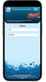
Input for a year
-
Input for key word to see project
Key words input to help find projects
Goals
-
Menu is easy to navigate
-
Social media can be easily accessed

Input year for certain projects
Goals
-
Frame photo
-
Easy to move
-
Easy to accomplish

Text pops up after the input for year or key word is inputed

Low-Fidelity Prototype
We created the first prototype with the goal of an easy quick experience.
Findings
I conducted two rounds of usability studies. Findings from the first study helped guide the designs from wireframes to mockups. The second study used a high-fidelity prototype and revealed what aspects of the mockups needed refining.
Round 1 Findings
-
User had trouble looking at the 3D models
-
User liked colors of the website
Round 2 Findings
-
User liked how easy it is navigate
Refining the Design
Mockups
Make the models can be accessed
We really want to focus on allowing the 3D models to be viewed


Before Usability Study
After Usability Study


High-Fidelity Prototype
The final high-fidelity prototype presented cleaner user flow for getting to the profile tab
Link to mobile prototype

Accessibility Considerations
1
We considered readability by ensuring font sizes and text placement. We also have had tested.
2
We added the choice to input a date to put up a project of a certain year
3
We wanted users to be able to quick and easily be able to look at the 3D ship models
Going Forward
Impact:
Inconclusion, Website has passed the research phase and will go on to the next stage. However, more testing will need to happen.
What I Learned:
We have learned that WordPress can be difficult to code in as it isn't as easy as HTML.
Next Steps
1
For the next step, we will need to add more to the projects page.
2
For the next step, we will try add a live project map that shows where the projects are happening in the world
3
Conduct another round of usability studies to validate whether the pain points users experienced have been effectively addressed.
Finished Product
Conclusion
We were able to make the website mobile friendly. We were able to get the 3d models working, the new map functioning, and got the logo animated and moving. We did not get a search bar working for the projects page, but we still got it organized. Overall, the project was a success. Link to website here
